You might have seen The Rockwell and other museums around the U.S. launching “Museum from Home” resources in the past couple of weeks, designed to help supplement your distance learning school activities and keep your students engaged and entertained. We know you’re probably balancing your home turning into the office, school, gym and playground and have a lot of other things to think about besides teaching your child art! However, art-making and creative play are proven mood boosters for children and adults alike. This blog series offers some tips and tricks for incorporating art into your new routines.
In Art from Home 101, you learned to avoid “cookie cutter” projects. In STEM to STEAM we talked about multidisciplinary projects. In this post, we ask how you can make art time even more impactful. What about incorporating diverse artists into your rotation while looking at art with your kids? While there are a lot of great “tried and true” art lesson plans out there, a lot of them rely on “tried and true” artists.
Think of five famous artists. Who came to mind immediately? Da Vinci, Michelangelo, Picasso and Van Gogh are often on the list. What do they have in common? Many of the artists we are familiar with are primarily white and male, with a few exceptions such as Georgia O’Keeffe and Frida Kahlo. That’s ok – the study of art has evolved and changed a lot over the past 50 years, as society has redefined who “gets” to be an artist. But now, one of the biggest benefits of looking at art with children is the opportunity for exposure to different perspectives. Ensuring that your little ones learn the names of artists from different backgrounds is a great way to teach tolerance and sow the seeds of diversity and equity.
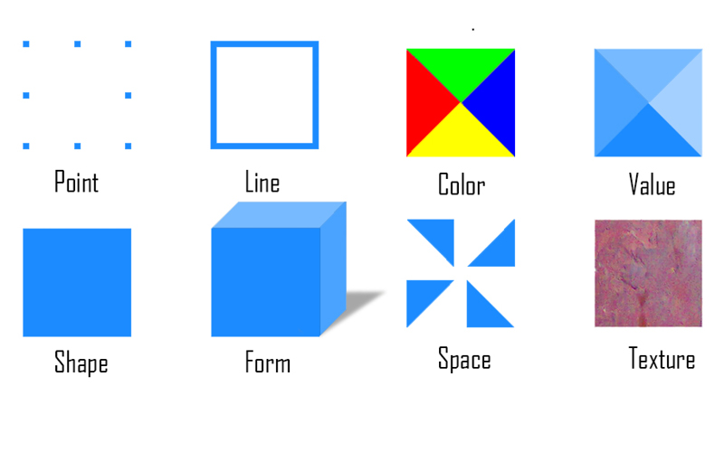
It’s hard to pick favorites, but here are a few American artists as great examples for looking at the elements of art – color, value, line, shape, form, space and – who may not be in your Art History 101 book. After you’ve explored our list, use the Smithsonian Learning Lab to continue to research other artists on your own!
1. Color & Value
The element of color has three parts: hue, value and intensity. Hue refers to colors themselves. Value is what you would think of as “shading,’ or the light and dark areas created. Intensity refers to how bright colors are.
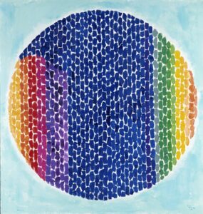
Alma Thomas’s intensely saturated colors set her abstract work apart. Her colors are far brighter than a lot of other color field painters in the 1960s. Do her colors make you happy?
You can see value as well as hue and intensity in Amy Sherald’s work. Her portraits are pretty realistic, but the way she uses value and hue make them a little otherworldly. She achieves this by adding either black and white paint to the pure paint pigment colors to dull them and make them either darker or lighter. Many colors can be mixed together to create different shades, and Sherald is a master at mixing colors for her portraits. How would it change her work if she used more realistic colors?
2. Line
Go ahead, draw a line! Did you draw a straight line? A wavy line? Lines can be thick, thin, straight, curvy and more. Types of line have different effects on the mood of an artwork. For example, diagonal or quick, short lines can convey energy.
Lalla Essaydi incorporates Arabic calligraphy into her photographs of women. She uses the lines of the calligraphy to define and fill the space. Speaking of space, what other element of art is important to her photography?
3. Shape & Form
Shapes are enclosed areas. Shape can be geometric, with straight sides, or organic. Form can also be geometric or organic, but form appears three-dimensional, or in the case of sculpture, is three-dimensional.
Allan Houser’s sculptures are slightly abstracted, which means they don’t look exactly like what they are meant to represent. He achieves this by slightly exaggerating the shape and form of his subject. Try drawing a person but exaggerating the shapes and see what a difference it makes!
Helen Zughaib, like many artists, is inspired by the artist Jacob Lawrence. Like Lawrence, Zughaib overlaps figures to create dynamic scenes. The shapes are the dominant element. What’s another element that is important to Zughaib’s work?
4. Space
 |
 |
Space can refer to perspective, or how we show depth in an artwork. This is most often seen in landscapes or in paintings that represent interior spaces, like a house.
Or, it can refer to positive or negative space. Negative space is the area of an artwork that does not have content. This can be a little difficult to visualize, so we’ve included the diagram below. The white areas is positive in the first image, and negative in the second.
A self-taught painter, Susan Waters creates depth or perspective in her paintings of landscapes and animals. Notice how the farther away something is, the smaller it is. Also, landscape elements change color when they are meant to appear farther away. Try these tricks in your drawings.
Kehinde Wiley fills the negative space around his portraits with elaborate patterns that relate to the figure in the painting. He does this instead of putting his figures into perspective within a scene. Do they stand out more this way, instead of in a traditional setting?
5. Texture
Texture can be tactile, or actual, meaning that if you touched the object it would feel fuzzy, hard, or silky. Texture can also refer to visual texture, which means areas of an artwork might look fuzzy, hard or silky, but the object won’t feel as it looks.
Sheila Hicks’ work represents tactile, or actual texture. She uses textiles to create inviting installations that we would love to touch (but don’t!) What do her shapes remind you of?
Mickalene Thomas creates collage portraits that have both tactile and visual texture. She uses unique materials to create layered artworks and make a clothing item appear velvety or a sofa look soft and squishy.
Still have questions?
The author of this series has taught art classes for 5 to 13-year-olds in one room at one time, does not hold a fine art degree and boldly leads parents with infants through museums. If you have specific questions about how to tailor a lesson to your multiple ages at home or how to get the most out of your DIY art curriculum, ask me anything!
Kate Swanson – SWANSONK@ROCKWELLMUSEUM.ORG